
CapitaLand Raffles City2026
Spring in the City
A miniature festive world unfolding from a book, developed into a campaign identity and animation.
- My role
- Concept · Art direction · Motion design
- Studio
- Carbon
My part in the work
I led this project from the concept and art direction through execution. Ying Lin and Ching tong Poy supported the execution, helping bring the final campaign assets together.
A new chapter opens
The brief centred on a magical pop up album: a key visual that could stand on its own and come to life across social and mall screens. I built the concept around Raffles City as a place of festive discovery, revealed as the book opens.
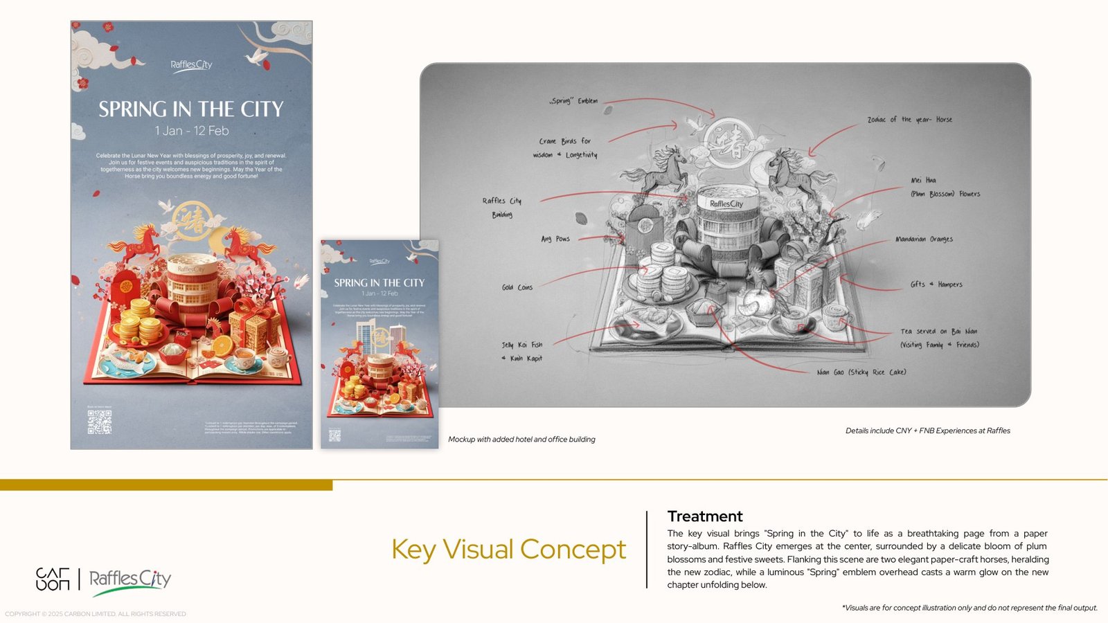
The miniature world brings together the architecture, horses, plum blossoms, mandarins, gifts and food. Paper forms gave these different elements a shared construction, while red and gold connected them to the season.

From a detailed sketch to a clear composition
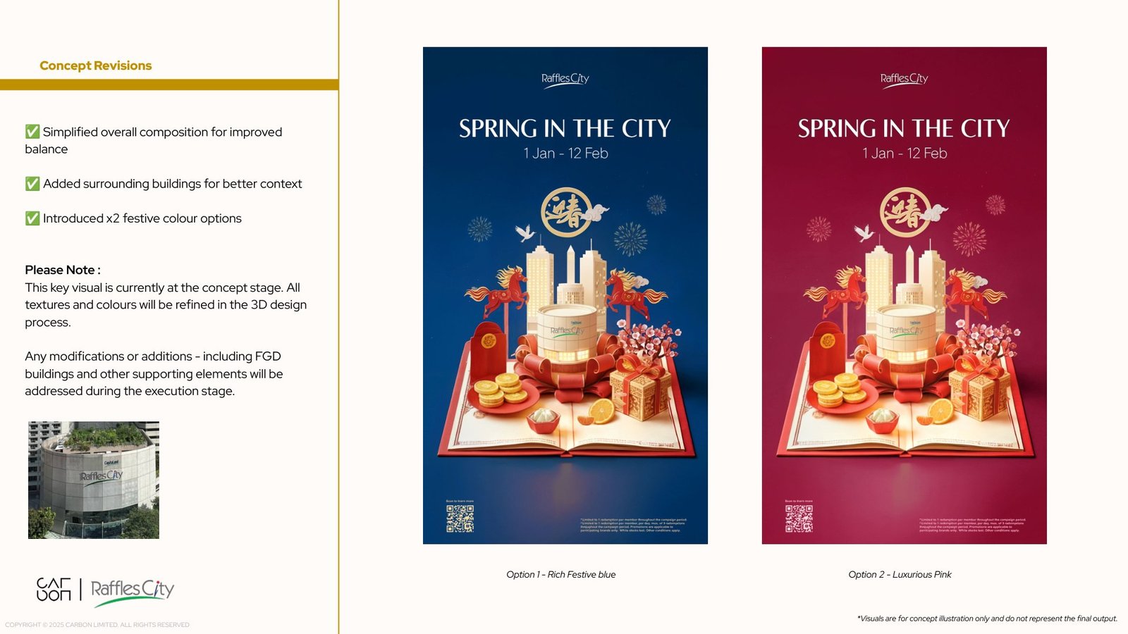
The early composition studies explored a larger illustrated arrangement and different background colours. As the key visual developed, we simplified the scene and gave the buildings a clearer place within it.
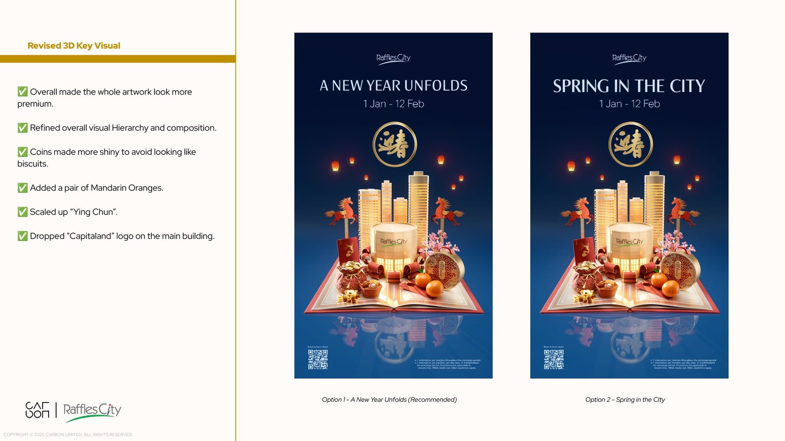
We refined the hierarchy with more reflective coins, a pair of mandarins, a larger spring emblem and adjustments to the central building. Material studies explored paper grain, gold foil and satin surfaces to give the objects contrast within the miniature world.
The approved crimson composition brought the architecture and festive details together around the open book.
Giving the book ten seconds
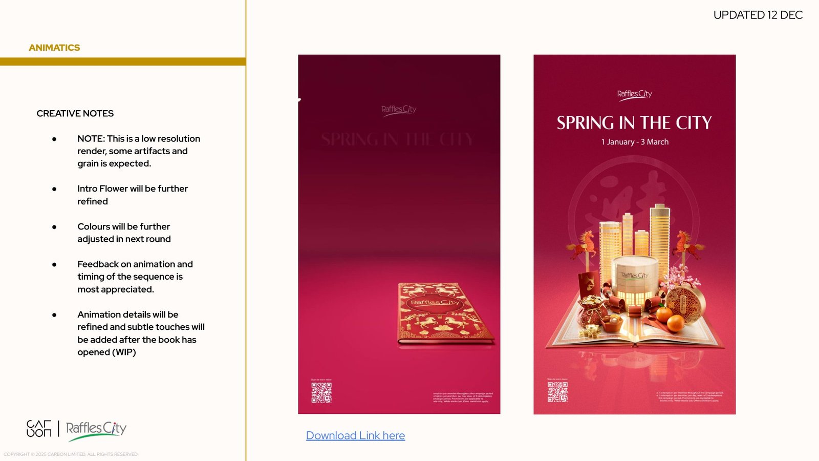
An early film proposal followed a paper horse through the album. The delivered animation concentrated the idea into a shorter book reveal.
Blossoms move across the closed cover. The book opens and turns as the buildings and festive objects rise with the folded pages. The movement settles into the key visual, giving the campaign title and information time to read.
That final hold was part of the design. The animation needed to introduce the world and then work as a clear campaign image on a screen.
One identity across the city
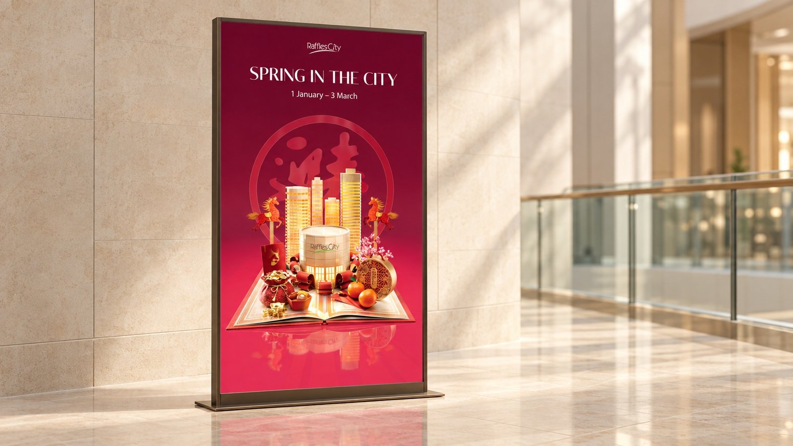
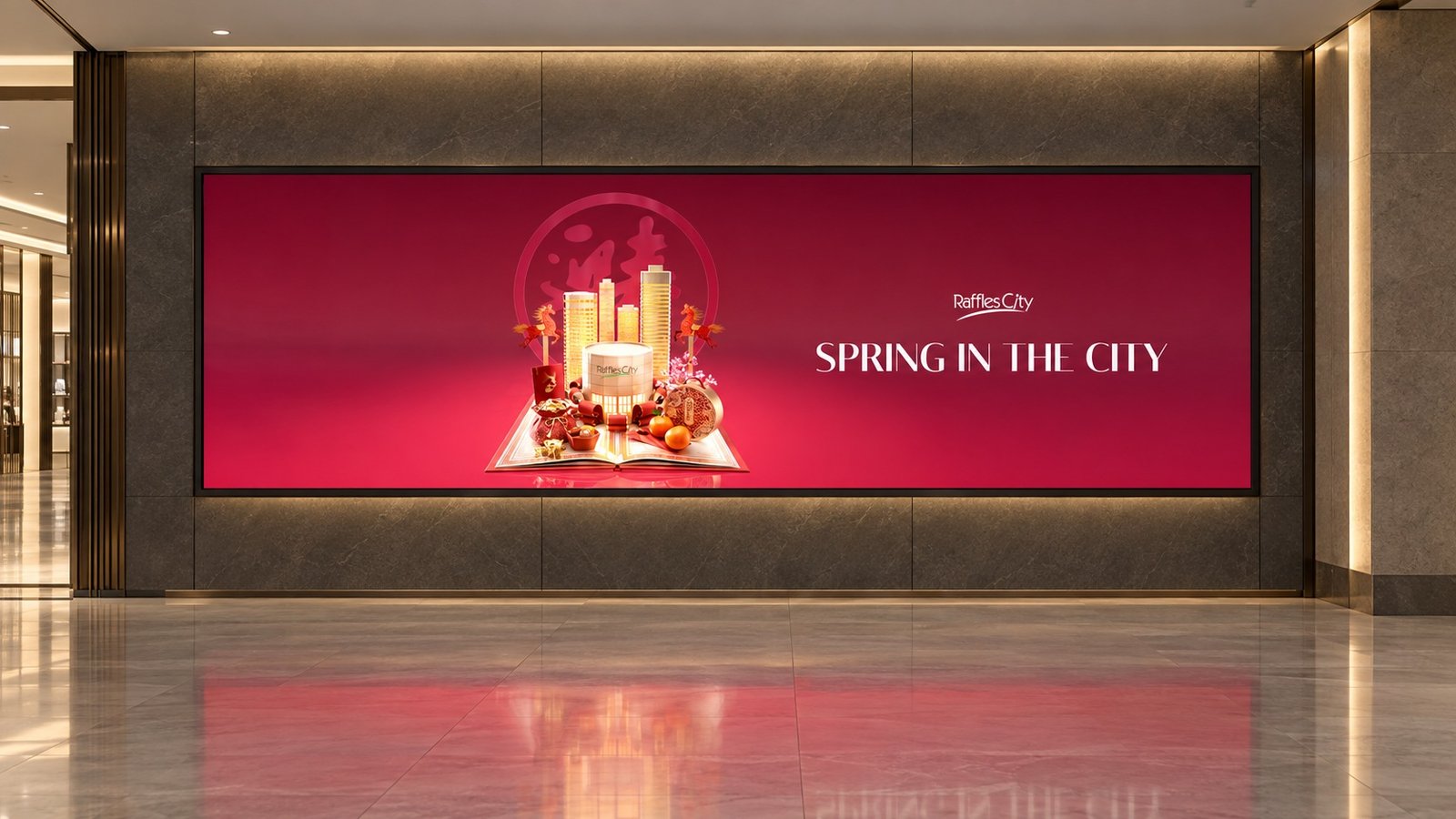
The composition was adapted for the website, social, email and print, alongside portrait animations for the mall’s different screens. Wide placements rearranged the key visual and typography; tall screens kept the unfolding book at the centre.
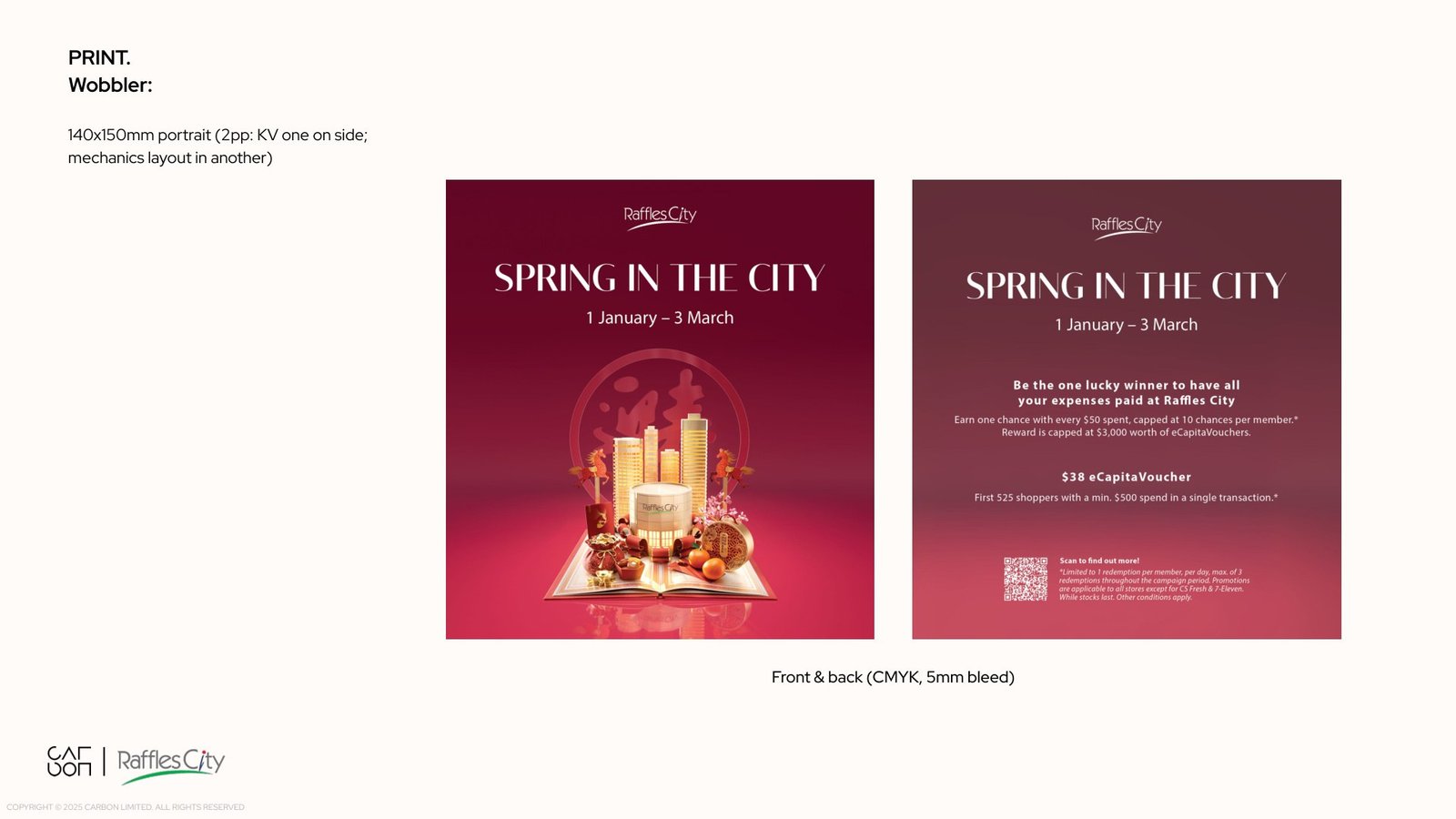
The artwork in context
The campaign identity was adapted for print, digital banners and screens around Raffles City. The presentation mockups below use the delivered artwork to show its scale and setting.
Carbon team
- Creative direction
- Matthew Crescenzo
- Associate creative direction
- Charles Cheong
- Art direction and motion design
- Jatin Gupta
- Design director
- Kyle Nai
- Project managers
- Aisyah · Aigner
- Designers
- Blair · Yian · Ying Lin · Ching tong Poy