
Razer Gold2026
Power Your Play
Two campaign films connecting gameplay, top ups and rewards through a shared motion language.
- My role
- Art direction · Storyboards
- Studio
- Carbon
My part in the work
I contributed to the art direction and storyboards with the Carbon team, shaping how the messages and gameplay would work together across the two films.
Two films, two jobs
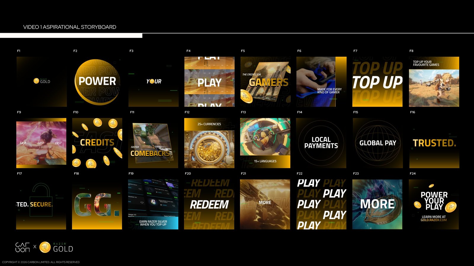
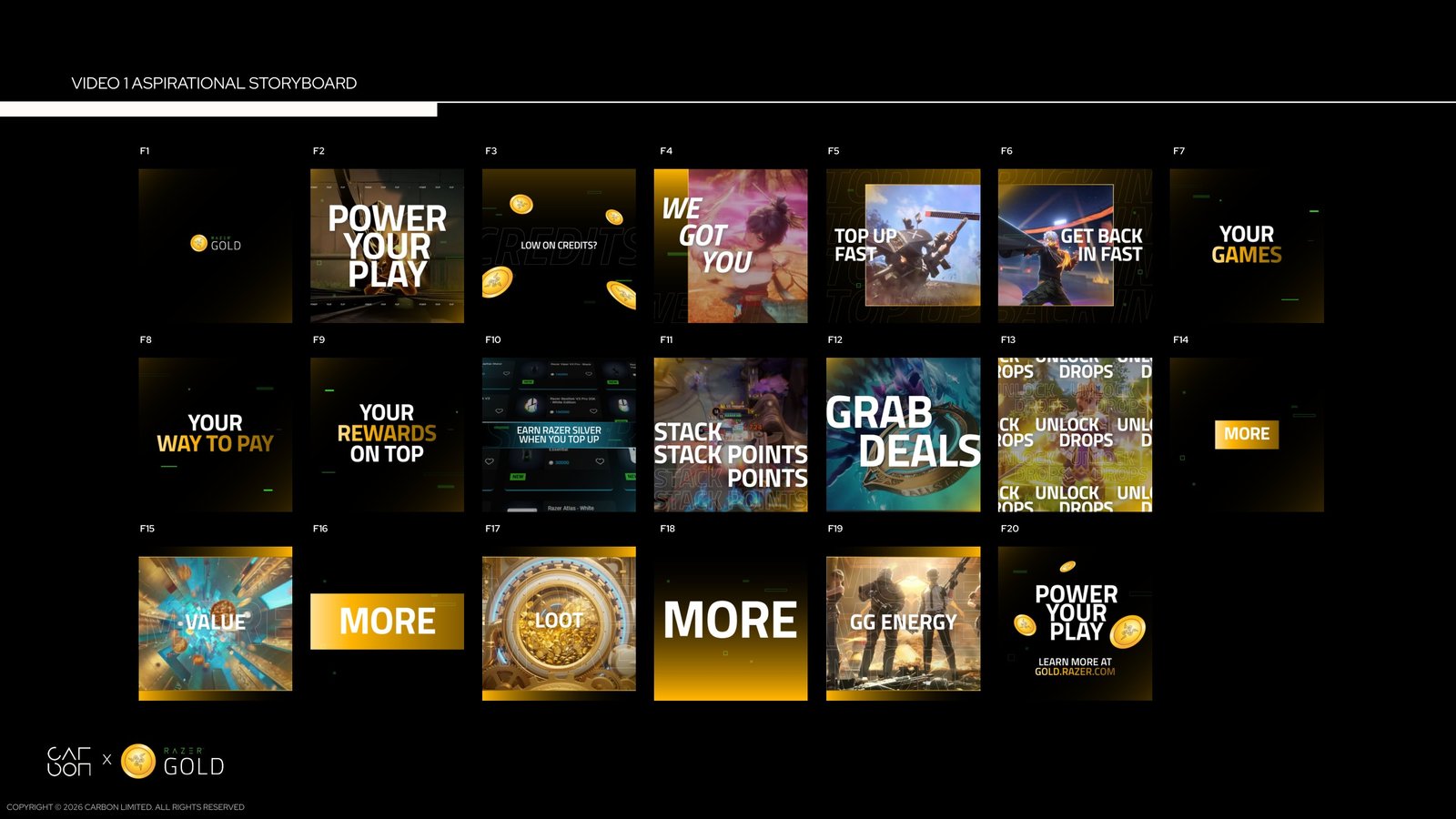
The brand refresh brief called for two complementary films. One introduces Razer Gold to new gamers through the breadth and energy of play. The other makes the reason to top up immediate, moving quickly through speed, value and rewards. Both use the same gold palette and graphic language.
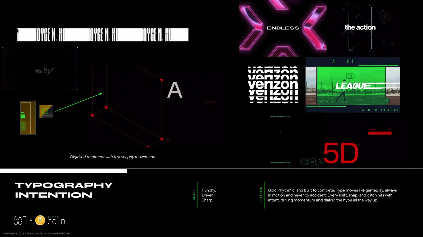
Type sets the pace
The visual direction treats typography as part of the action. Repeated words, sharp scale changes and framed gameplay create a rhythm that can move from brand statements to practical benefits. The gold coin provides a recognisable transition between games, payments and rewards.
Plan the message before the edit
The boards map out how each message lands against gameplay, product screens and graphic transitions. Seeing both sequences together helps keep the two films related while giving each its own pace and purpose.
Carbon team
- Creative direction
- Matthew Crescenzo
- Associate creative direction
- Charles Cheong
- Art direction and motion design
- Jatin Gupta
- Design director
- Kyle Nai
- Project managers
- Aisyah · Aigner
- Designers
- Blair · Yian · Ying Lin · Ching tong Poy